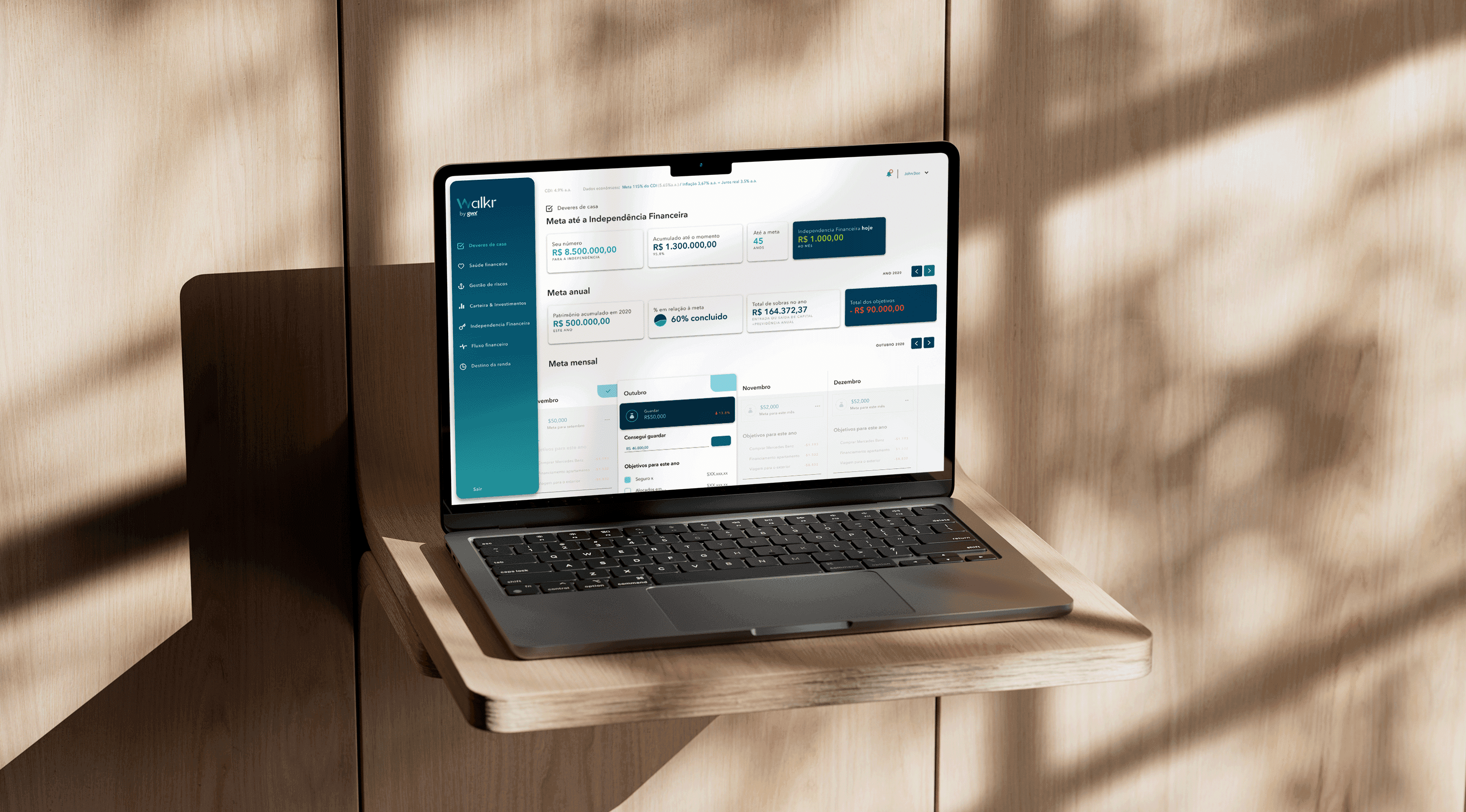
Ditching Spreadsheets and Empowering Financial Plans
WalkrApp, a leading Brazilian financial planning company, faced two critical challenges: confusing client experiences and operational inefficiencies due to their complex spreadsheet-based system. Clients struggled to navigate their plans, hindering both goal achievement and brand trust. Specialists were bogged down with manual tasks, limiting their abilit...
Walkr is not just another case study
WalkrApp, a leading Brazilian financial planning company, faced two critical challenges: confusing client experiences and operational inefficiencies due to their complex spreadsheet-based system. Clients struggled to navigate their plans, hindering both goal achievement and brand trust. Specialists were bogged down with manual tasks, limiting their ability to provide personalized guidance. My team and I undertook a human-centred approach to develop and launch a user-friendly and interactive Minimum Viable Product (MVP).
Goals and results
WalkrApp, a leading Brazilian financial planning company, faced two critical challenges: confusing client experiences and operational inefficiencies due to their complex spreadsheet-based system. Clients struggled to navigate their plans, hindering both goal achievement and brand trust. Specialists were bogged down with manual tasks, limiting their ability to provide personalized guidance.
My team and I undertook a human-centred approach to develop and launch a user-friendly and interactive Minimum Viable Product (MVP) aimed at: Client Empowerment — simplifying financial data visualization through intuitive dashboards, visualizing goals, tracking progress, and confidently celebrating milestones with engaging features; Specialist workflow optimization — streamlining the experience of data collection and input, leveraging time-effort in client consultations and enabling efficient tailoring of financial strategies; and Knowledge Continuity — fostering a collaborative knowledge-sharing environment to safeguard expertise against talent turnover.
The MVP wasn't just user-friendly, it tackled inefficiency. Manual updates? Slashed by 40%, freeing specialists for deeper client bonds. New recruits? Onboarded in 1 week, not 2, thanks to the platform's usability. Confused calls? Down 30%, as dashboards made financial plans crystal clear. This is just the first chapter in WalkrApp's magical journey, weaving a future where financial freedom is accessible to all.
A three-day collaborative whirlwind.
To uncover Walkr's landscape, we embarked on a three-day design sprint — a whirlwind of collaboration. I started by recruiting a diverse team: WalkrApp's visionary founder, experienced financial planners, and customer-centric marketing and service specialists, united in a shared mission. Fueled by caffeine and purpose, we delved into the heart of the matter.
Day 1: Cracking the Code — I kicked off with an overview of a Money Heist-themed design sprint. This playful theme not only boosted team spirit but also served as a fitting analogy for our mission: reinventing Walkr's experience. After breaking the ice, we embarked on a collaborative journey mapping the company's operations, charting every turn of the financial planning process. The founder and key experts took the stage, sharing their vision and daily challenges. Our team transformed these insights into actionable "How might we's?". We huddled around an Affinity Map, clustering questions into strategic themes. Three key challenges emerged: How might we standardise the formulary completion process? What would allow for a more straightforward training process for financial advisors? How might we help customers understand their financial plan via the app? As the day closed, we prepped for the next phase — each team member picked an app beyond the financial world and prepared a short presentation.
Day 2: The Great Sketch Heist — We began with a recap of Day 1 and revisited the Affinity Map. The presentations took center stage. Fabulous, a habit-building app, caught everyone's attention. We employed a democratic voting system to prioritize the most promising inspirations. Armed with voted-for inspirations, we unleashed a sketching frenzy using the "Crazy 8s" method, churning out eight quick ideas each. It was surprising how engaged they were — I had wrongly expected them to be shy.
Day 3: From Prototype to Profits — The final day was a showcase of polished ideas. Each team member proudly presented their solutions, sparking lively discussions. Using a voting system, we identified the most promising solutions, laying the foundation for our future platform. We walked away with a shared vision — built by the team, for the team.
Prototyping WalkrApp's Path to Personalized Financial Empowerment.
The design sprint had mapped the path, now it was time to build brick-by-brick. Armed with low-fidelity prototypes and mind-maps, I dove into crafting the core of the new WalkrApp experience. Partnering with a developer, we embarked on a deep dive into their existing spreadsheet system, a complex web of information begging to be transformed. While my focus lay in weaving data into a clear and captivating visual narrative, my partner tackled the underlying mathematical foundations.
Recognizing the founder's vision for intuitive dashboards, we co-created an initial design to demystify financial plans for clients. I firmly believed that powerful information visualization was the key, and these low-fidelity prototypes served as a launchpad for rapid iteration with the founder.
However, the financial advisors also needed support. I meticulously crafted a mind-map to streamline data collection. This wasn't just about efficiency; it was about liberating advisors from tedious tasks, allowing them to focus on personalized guidance and building genuine relationships with their clients.
Our initial prototypes hummed to life, dashboards whispering their stories of financial health. Functionally, they were flawless, but something was missing. The founder pointed out the void — the absence of that personal touch, the human narrative woven into the cold fabric of data. We made a strategic decision: prioritize practicality for now, lay the groundwork for future embellishments. These initial iterations were essential first chapters.
Building Walkr's Brand-Conscious Interface.
After sketching the possibilities, it was time to paint the picture. This phase brought the conceptual designs to life, transforming them into tangible, interactive dashboards that resonated with Walkr's brand identity.
Seven meticulously crafted dashboards replaced the sprawling seas of data in the old spreadsheets. By clustering information around key themes, these digital tapestries made financial insights clear and captivating for users.
Designing the formularies wasn't just about functionality; it was about respecting the flow of financial advisors. Segmenting data input mirrored the familiar process advisors used to, ensuring ease of use and seamless transition from old to new.
Each element underwent rigorous design reviews throughout development. This meticulous process ensured the final product stayed true to the initial vision, not only in usability but also in aesthetic appeal, upholding WalkrApp's high standards.
By prioritizing brand, intuition, and seamless transitions, we crafted dashboards that were not just visually engaging but functionally robust. This marked a significant improvement over the old spreadsheet system, paving the way for a user experience that was as informative as it was beautiful.
What worked, what was hardest, what I'd do differently.
This project was a pivotal moment in my freelance career, allowing me to apply and expand my skills in project management and client engagement. It bolstered my confidence in my abilities and provided me with deeper insights into financial planning.
One of the highlights was the client's enthusiastic response to our initial digital transformation sketches, affirming the impact of our work. Ultimately, the Walkr App project was not just a professional achievement but also a personal journey of growth and learning, leaving a lasting impact on both the company and its clients.
Continue through adjacent product systems.
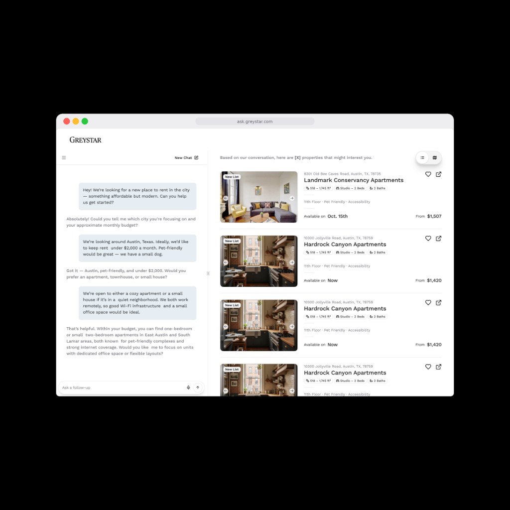
Ask Markerr: Designing an AI Rental Search Experience for People Who Want to Trust It, But Shouldn't Blindly
A strategic rental-search POC/MVP for Markerr, designed to make conversational AI feel approachable without becoming blindly persuasive.
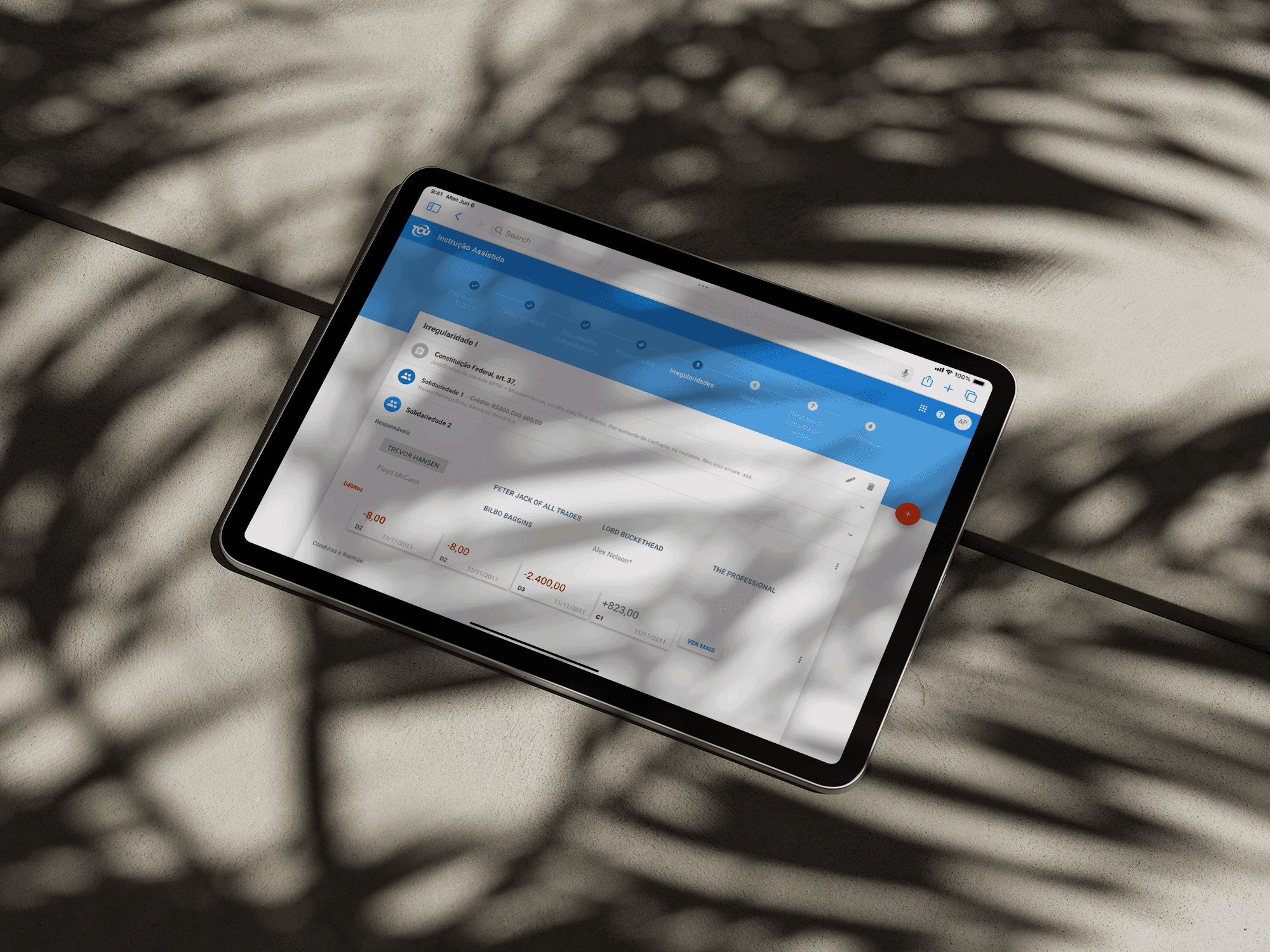
Designing trust into a government-scale AI audit system
AI-assisted legal instruction authoring for the Brazilian Federal Court of Accounts. Writing time reduced by 63%.
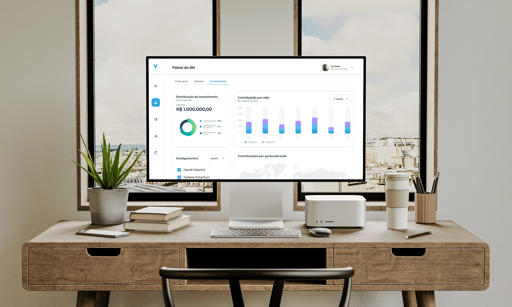
Two platforms, one product: B2B pensions for HR and brokers
B2B platform architecture and multi-surface workflow design for HR managers and brokers.