Back
Two platforms, one product: B2B pensions for HR and brokers case study visual
Vinci

Two platforms, one product: B2B pensions for HR and brokers

Platform ArchitectureB2BPermissions

Vinci was entering corporate pensions late, with seasoned specialists but no user-facing platform. They asked us to build one. The complication: the platform had two B2B audiences with almost nothing in common. HR specialists administered plans for thousands of employees; brokers sold new plans to corporations. We argued for two platforms on a shared data...

2022
Year
Financial services / pensions
Industry
Remote / Distributed
Client Location
Senior UX Designer
Role
3 months
Timeline

Vinci is not just another case study

Vinci was entering corporate pensions late, with seasoned specialists but no user-facing platform. They asked us to build one. The complication: the platform had two B2B audiences with almost nothing in common. HR specialists administered plans for thousands of employees; brokers sold new plans to corporations. We argued for two platforms on a shared data foundation, and the work followed. The project ran for three months in 2022: competitor analysis, 7 user interviews, a Lean Inception workshop, and dual-platform design with shared components.

Discovery

Understanding two audiences with almost nothing in common.

Vinci had deep domain expertise in corporate pensions but no user-facing platform. The business challenge was clear: build a platform that lets HR specialists administer plans and brokers sell them. The user challenge was less obvious: these two audiences had different goals, workflows, and mental models.

HR specialists worked in batch mode. They processed hundreds of employees at a time: new enrollments during onboarding windows, quarterly invoice reconciliation, annual compliance reporting. Their work was cyclical and exception-driven. They needed to see everything, identify outliers, and resolve systematically.

Brokers worked in deal mode. Each sale was a unique configuration: understand the client's needs, model contribution scenarios, compare against competitors, close the deal. Their work was episodic and persuasive. They needed to move fast, iterate visually, and generate presentation-ready materials.

We ran competitor analysis to generate hypotheses, then tested them in interviews with 2 HR specialists and 5 brokers. The research confirmed the core insight: a single configurable product would please neither audience. The dual-platform decision emerged in week two, before any design work began.

Design Decisions

Six screens, three per platform, each solving a core audience tension.

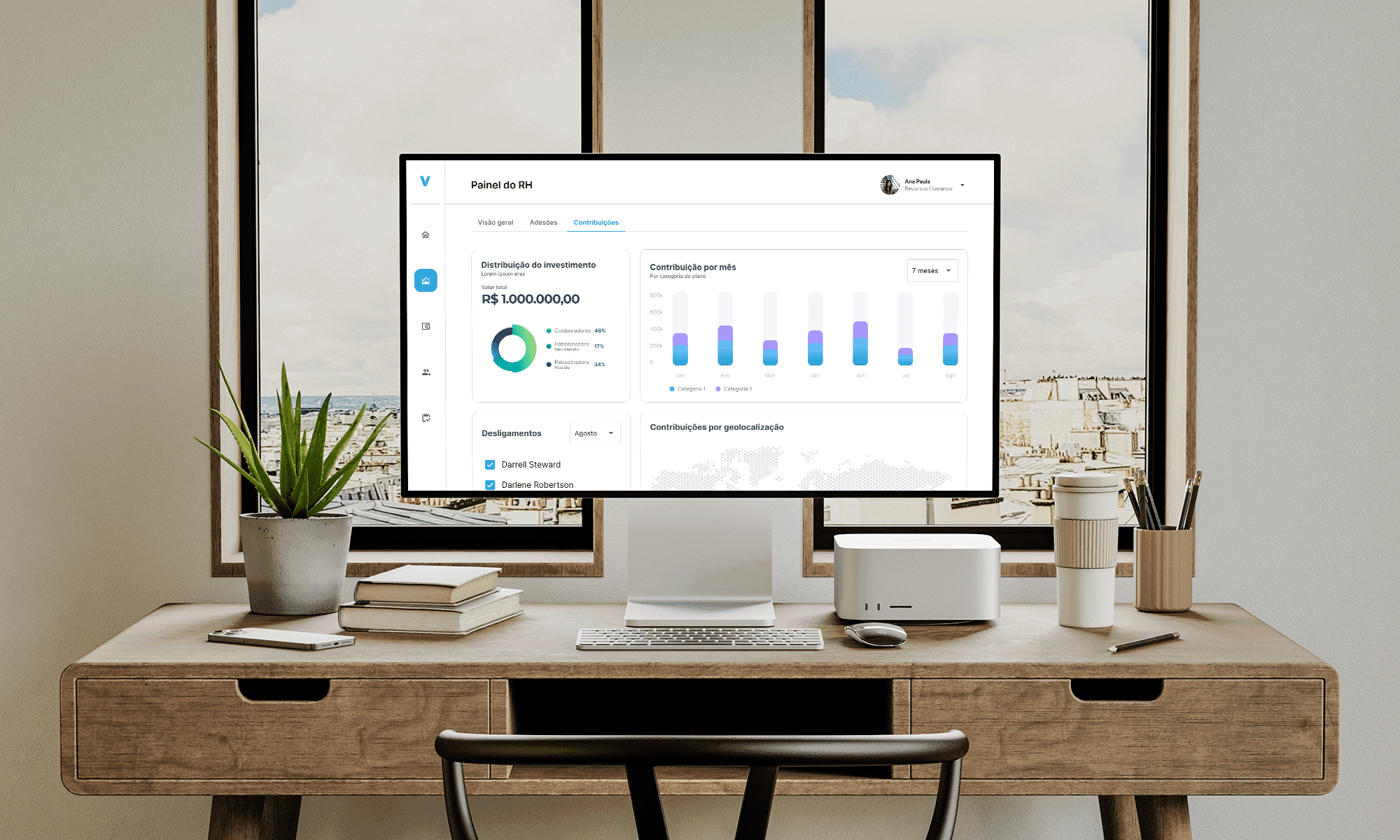
The design work separated the two platforms while sharing foundations. Each major screen embodied a principle derived from research: HR needed batch operations and exception visibility; brokers needed deal speed and visual persuasion.

Decision 01

Data table as primary view for HR, not dashboard cards

HR specialists worked with hundreds of employees at a time. Card-based dashboards — popular in consumer fintech — forced them to scroll endlessly to find outliers. They needed density and filtering, not visual simplicity.

Designed the HR primary view as a data table with advanced filtering, sorting, and bulk actions. Exception highlighting (unusual contributions, missing data, compliance flags) surfaced without manual scanning.

HR specialists could process batches efficiently and catch exceptions without hunting. The table format matched their existing mental models from HRIS and payroll systems.

Processing time per batch dropped. More importantly, exception rates fell because issues were visible immediately rather than discovered during reconciliation.
Decision 02

Wizard-based enrollment for predictable HR workflows

New-hire enrollment happened in predictable bursts — January onboarding, mid-year hires. HR needed to process many employees through the same steps without errors. The existing process was ad-hoc, prone to missed steps.

Built a wizard workflow for enrollment: upload roster, validate data, confirm contributions, submit. Progress indicators showed completion state for each employee. Error states trapped issues before submission.

Enrollment became systematic rather than ad-hoc. HR specialists could process batches confidently, knowing the wizard enforced completeness.

Enrollment errors dropped significantly. The wizard caught data issues at validation rather than post-submission reconciliation, saving rework.

Decision 03

Automated compliance reporting with preview

Quarterly compliance reporting required collating data from multiple sources, formatting to regulatory specifications, and manual review. HR spent days preparing reports that should have been automatic.

Built one-click report generation with preview before submission. Data pulled automatically from the platform; formatting followed regulatory templates. Preview let HR verify accuracy before formal submission.

Report preparation time dropped from days to hours. The preview caught errors before they became compliance issues.

Compliance risk reduced. The automated pipeline eliminated manual transcription errors that had previously triggered regulatory inquiries.

Decision 04

Proposal builder with side-by-side scenario comparison

Brokers configured pension proposals by manually calculating contribution scenarios and building presentations in PowerPoint. Each iteration with the client required recalculation and reformatting.

Built a proposal builder with real-time scenario comparison. Brokers could adjust contribution rates, employer matches, vesting schedules and see immediate impact on retirement projections. Side-by-side comparison showed multiple scenarios simultaneously.

Brokers could iterate with clients in real-time rather than "I'll get back to you." The visual comparison made trade-offs concrete: "See how increasing the match affects projected retirement age."

Deal cycle time shortened. More importantly, the interactive proposal differentiated Vinci from competitors still using static presentations.

Decision 05

Deal pipeline view for broker workflow management

Brokers managed multiple deals simultaneously, each at different stages: initial contact, needs assessment, proposal, negotiation, closing. They needed visibility across their pipeline, not just the current deal.

Designed a deal pipeline view showing all active deals by stage, with quick-access to each proposal. Color-coded indicators showed deal health: green for on-track, yellow for stalled, red for at-risk.

Brokers could manage their portfolio of deals without losing track. The pipeline view replaced spreadsheet tracking and sticky notes.

Deal velocity increased because brokers could prioritize effectively. Stalled deals got attention before they went cold.

Decision 06

Integrated presentation mode for client meetings

Brokers exported proposals to PowerPoint for client meetings, then manually updated when clients asked "what if?" questions. The export-and-present workflow broke the interactive conversation.

Built presentation mode directly into the proposal builder. Brokers could project the interface during client meetings and adjust scenarios in real-time. Changes reflected immediately; no export needed.

Client meetings became interactive conversations rather than static presentations. Brokers could respond to "what if?" questions on the spot.

Closing rates improved. The interactive capability differentiated Vinci and built client confidence through transparency.

Testing

Show-and-tell sessions with HR and broker reference users.

Testing happened in working sessions, not formal usability studies. We ran weekly show-and-tell sessions with the same reference users who had participated in interviews. Each session reviewed 3-4 screens; feedback was incorporated by the next week.

The HR table view was initially too dense. We had optimized for information density but sacrificed readability. Testers asked for adjustable column widths and row density controls. We added both; HR specialists customized their views immediately.

The broker proposal builder lacked a comparison reset. Users could create scenarios but struggled to return to baseline. We added a "reset to original" control that preserved the conversation flow.

The wizard step indicators were confusing. HR specialists did not understand which steps were complete versus in-progress. We moved from dots to explicit status labels: "Pending," "In Progress," "Complete."

By week eight, reference users stopped critiquing and started asking about rollout dates. That was the signal: the platforms had crossed from "external design" to "their tools."

Impact

Two platforms shipped, research-validated, in three months.

Shipped two distinct platforms on a shared data foundation in three months. The dual-platform decision, validated through research, prevented a single-product compromise that would have pleased neither audience.

100+ research insights anchored every priority call. When debates arose about feature sequencing, we referenced the interview data. Research gave us ground to stand on.

The shared design system enabled the timeline. Component reuse across HR and broker platforms meant neither surface was an afterthought. Without shared foundations, three months would have shipped one platform well and one poorly.

User story quality improved after the rewrite. The product manager's second-draft stories — written after internalizing user motivations — drove clearer priority decisions than the technical specifications she started with.

Stakeholder engagement remained healthy despite the research protocol. The mitigation strategy — checkpoints, intervention protocols, cross-checks — preserved both data quality and the client relationship.

Learnings

What worked, what was hardest, what I'd do differently.

What worked: The dual-platform decision actually simplified stakeholder conversations. When we presented research showing the two audiences had non-overlapping primary tasks, the "build two" recommendation felt inevitable rather than expensive. The data made the case.

What was hardest: Managing stakeholder involvement in research without damaging the relationship or biasing the data. The protocol — explicit checkpoints, intervention triggers, cross-checks — was more work than expected but worth it.

What I'd do differently: Get the product manager into user research sessions from day one. By the time she rewrote stories the second time, she understood the audiences. Bringing her into interviews earlier would have saved a rewrite and caught priority calls we made twice.

What surprised me: The shared design system was not just efficient — it was essential. Three months for two platforms was only possible because components could be reused. I had expected efficiency gains; I had not expected the project to be impossible without them.